Picture this: a car that doesn’t just turn heads but twists them right off. A vehicle is so unapologetically original that it makes everything else on the road seem like yesterday’s news. That’s a Jaaag!
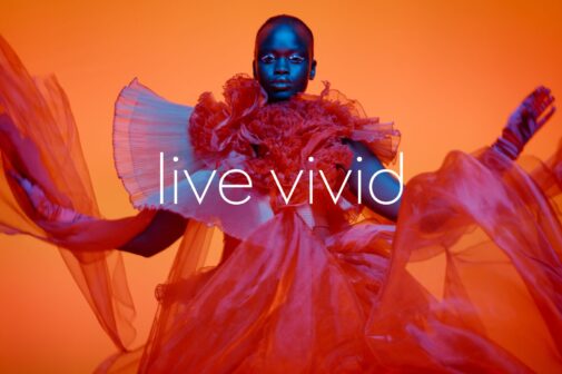
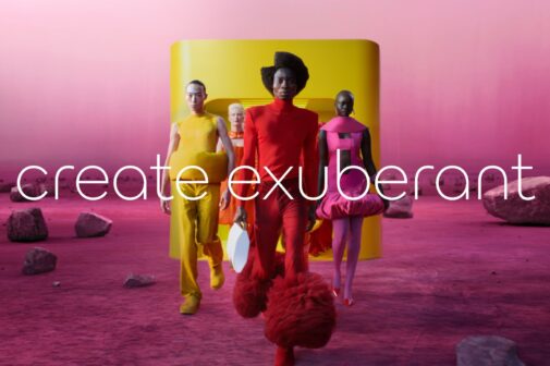
The now reimagined Jaguar identity is shaped by ‘Exuberant Modernism’, a creative philosophy that embraces a daring and unconventional thinking approach.
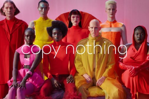
Professor Gerry McGovern, the Chief Creative Officer, puts it like this: Jaguar’s foundation is built on originality. Sir William Lyons believed that a Jaguar should be a copy of nothing.
So, what’s new? Well, they’ve rolled out a brand identity that’s as striking as a thunderbolt on a clear day. Four symbols define this new chapter, each loaded with meaning and a hint of what’s to come.
This is Jaguar’s new signature. It celebrates modernism with geometric shapes, symmetry, and simplicity. It blends upper and lowercase letters in a way that’s as smooth as a V12 engine.
A bold line that doesn’t just underline Jaguar’s name—it propels it forward. It slices mediocrity.
Forget shades of grey. Jaguar is splashing primary colours—yellow, red, and blue—like a painter gone wild.
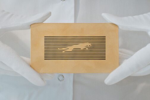
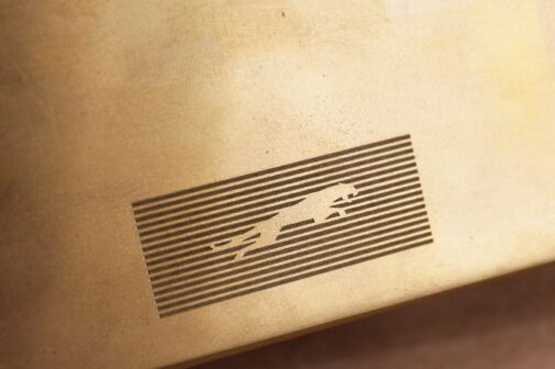
The iconic Jaguar ‘leaper’ has been reimagined. It’s still leaping forward, symbolising excellence and serving as a hallmark of the brand.
On the 2nd of December 2024, during Miami Art Week, Jaguar will unveil “Copy Nothing”—a global public installation that brings their philosophy to life. Expect the unexpected!
So there you have it. Jaguar isn’t just stepping into the future; it’s taking a running leap. And if this is what ‘Copy Nothing’ looks like, the road ahead just got a lot more exciting.


